CSS Flexbox: An Implementation oriented Visual Guide

Flexbox is a set of properties that can be applied on HTML layout elements to help make the contents of websites responsive. This Visual Guide aims to help you quickly visualize & understand the end result of the flexbox properties; individually & combined together with other CSS properties such as float and position. Let's dive right in!
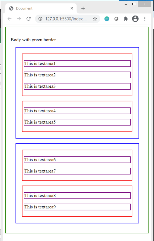
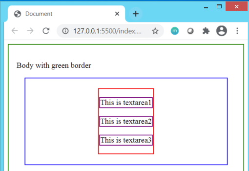
Initial layout of our page:
HTML
<body>
    <p>Body with green border</p>
    <div class="container superset1">

        <div class="columns set1">
            <p class="textbox box1">This is textarea1</p>
            <p class="textbox box2">This is textarea2</p>
            <p class="textbox box3">This is textarea3</p>
        </div>
        <div class="columns set2">

            <p class="textbox box4">This is textarea4</p>
            <p class="textbox box5">This is textarea5</p>

        </div>
    </div>
    <div class="container superset2">

        <div class="columns set3">
            <p class="textbox box6">This is textarea6</p>
            <p class="textbox box7">This is textarea7</p>
        </div>
        <div class="columns set4">
            <p class="textbox box8">This is textarea8</p>
            <p class="textbox box9">This is textarea9</p>
        </div>
    </div>
</body>
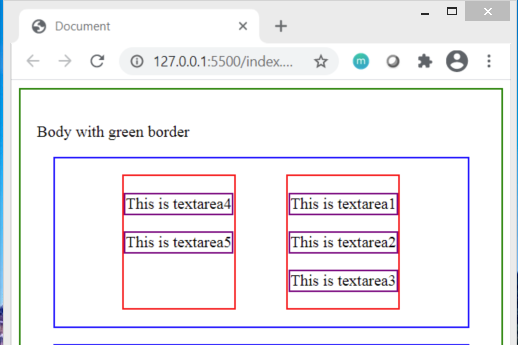
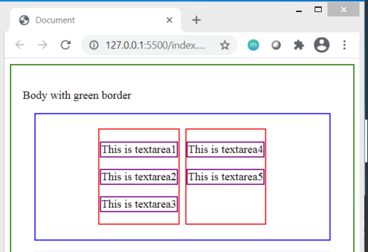
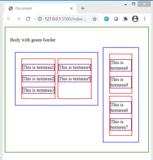
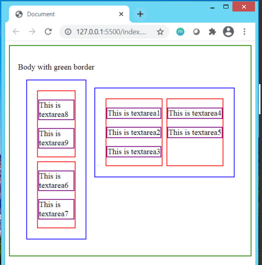
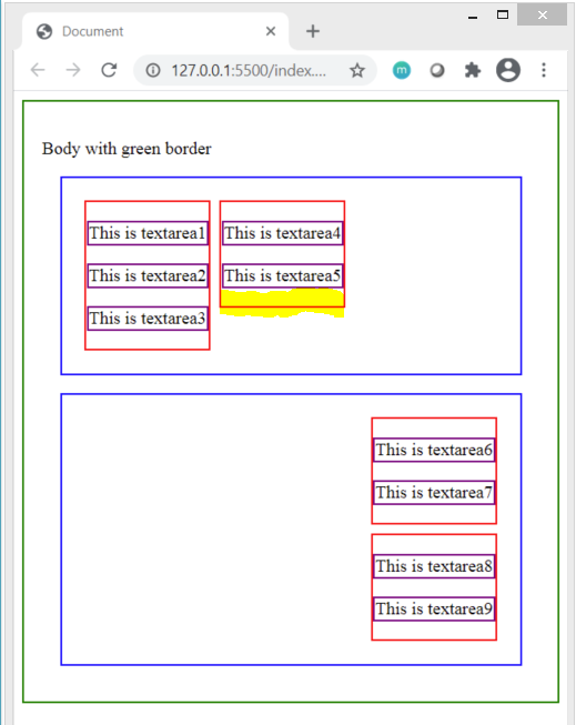
Here's how it looks with borders applied to the container(blue), columns(red) & textbox(purple) CSS classes:
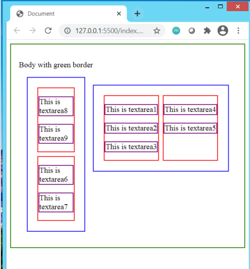
Let's start applying flexbox to the div class .superset1 and .superset2 (blue border) by implementing display:flex;
Additionally, apply flex-direction:column; to .superset2.
.superset1{
    display:flex;
}
.superset2{
    display:flex;
flex-direction: column;
}
Result:
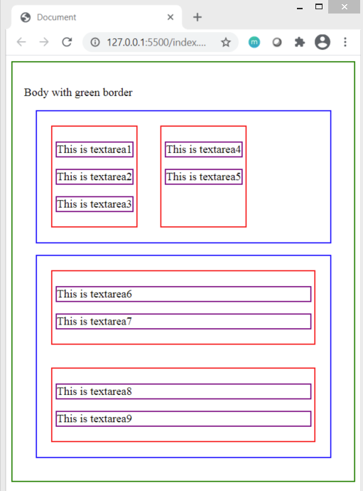
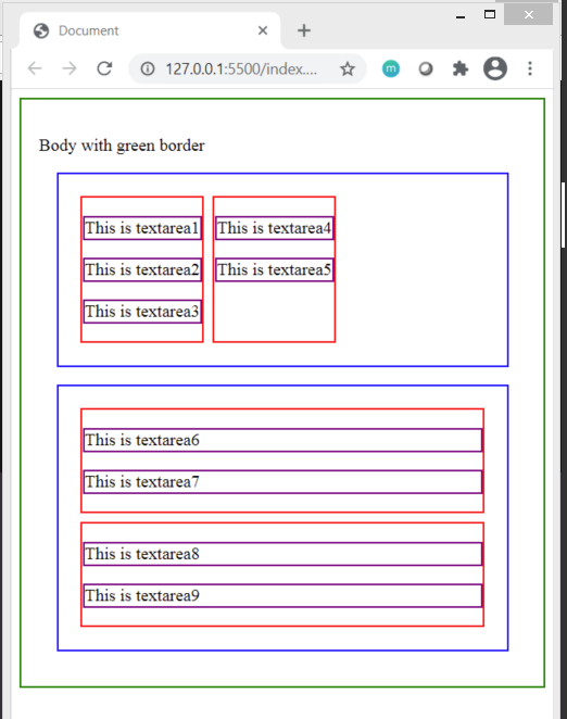
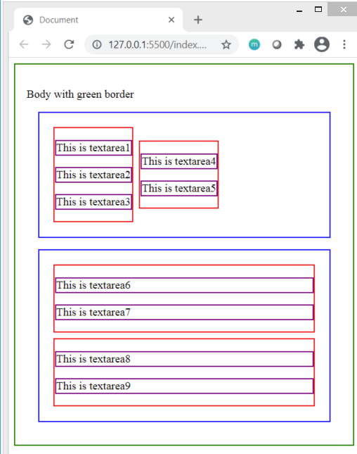
display:flex within div having class superset1 has positioned the red boxes in a single row next to each other
This is because display: flex has flex-direction: row; set by default. The direction is from left to right.
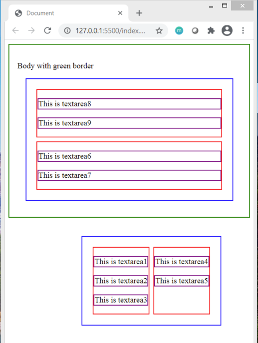
Setting flex-direction: column; to div having class .superset2 : the red bordered boxes continue to be positioned below each other forming a single column on the page. The direction is from top to bottom.
Apply flex-direction:row-reverse; to div class .superset1 and flex-direction:column-reverse; to div class .superset2.
.superset1{
    display:flex;
    flex-direction: row-reverse;
}
.superset2{
    display:flex;
flex-direction: column-reverse;
}
Result:
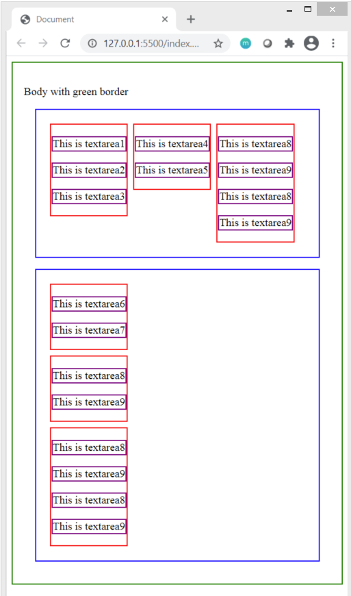
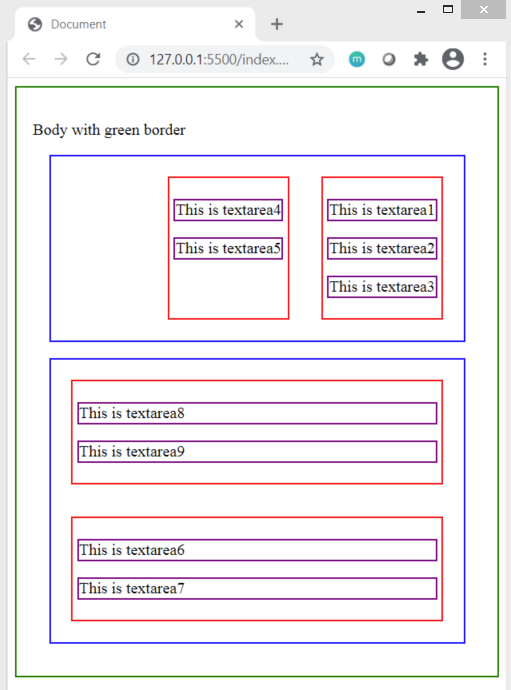 Notice the ordering of the boxes by focusing on the text-area boxes. The position of the red boxes just got reversed!
flex-direction:row-reverse; has a right to left direction for placing elements
flex-direction: column-reverse;has a bottom to top direction for placing elements.
Note the space taken up by the contents within the red boxes in all scenarios. Did you notice a difference in the space available around as well as within the red bordered div containers?
To handle the space observed in above examples, let's implement next flex property justify-content:space-between; to .superset1 and justify-content:space-around; to .superset2 classes.
.superset1{
    display:flex;
    flex-direction: row-reverse;
    justify-content: space-between;
}
.superset2{
    display:flex;
flex-direction: column-reverse;
justify-content: space-around;
}
Result:
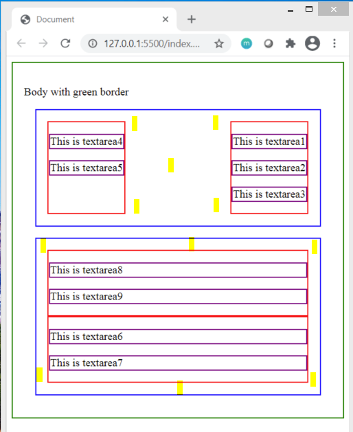
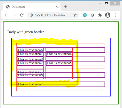
The yellow highlighted marks show the redistribution of space between the two red bordered div tags in first container and around the red bordered div tags in the second container.
Next, if we set the value justify-content:space-evenly; to .superset1, we can clearly notice the change in spacing between the two red bordered div tags
.superset1{
    display:flex;
    flex-direction: row-reverse;
    justify-content: space-evenly;
}
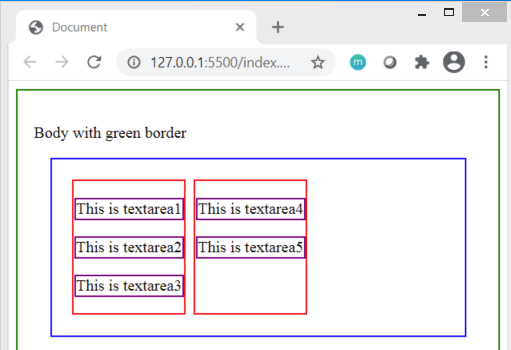
Following are some other justify-content values applied on .superset1 class & their visual results:
justify-content:flex-start;
 Observe that the flex-start follows the direction of writing which in this case is set to begin from right to left due to
 flex-direction:row-reverse; applied earlier.
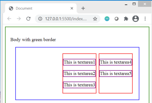
Applying justify-content:flex-start; whenflex-direction: row; is applied would result in same output as seen below :
Set
justify-content:flex-end; :
Set
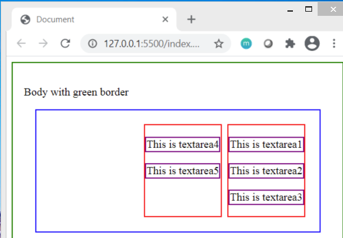
justify-content:center; to .superset1 class. I have commented the HTML for the red container having textbox4 & textbox5 to see the red bordered div get centered with respect to the outer blue container.
Without commenting out the html of other red bordered div, we can observe both the red bordered div boxes to be positioned together as a single entity in the center of the blue container :
What happens when we apply
float:left; to .superset1 class?
.superset1 {
    display: flex;
    flex-direction: row;
    justify-content: center;
    float:left;
}
 What happens when we apply
 float:right to .superset1 class?
.superset1 {
    display: flex;
    flex-direction: row;
    justify-content: center;
    float:right;
}
 What happens when we apply
 position:relative; to the .superset1 class?
.superset1 {
    display: flex;
    flex-direction: row;
    justify-content: center;
    float:right;
    position: relative;
}
 There's no change as the items stay aligned relative to each other & do not overlap each other. But what happens when we apply
 position:absolute; to the .superset1 class?
.superset1 {
    display: flex;
    flex-direction: row;
    justify-content: center;
    float:right;
    position: absolute;
}
The positioning get's overlapped by other elements on the page. We can set the top, right, left & bottom properties to have the item fixed at a particular position on the page. Applying top:40%; and right:10%; to our above overlapped .superset1 class, we get the below result:
Note how the entire blue container positioned with absolute values has moved outside the scope of the body tag ( outside green border) & that the blue container within the body tag has used up all the space inside. Similarly, we can assign the top, right, left & bottom to the container when it's position is set to relative.
Setting the CSS properties of
.superset1 and .superset2 back to following:
.superset1 {
    display: flex;
    justify-content: flex-start;
}
.superset2 {
    display: flex;
    flex-direction: column;
    justify-content: flex-start;
}
Moving ahead to the align-items align-items property of flexbox.
Let's apply align-items:flex-start; and align-items:flex-end; to .superset1 and .superset2 classes respectively.
.superset1 {
    display: flex;
    justify-content: flex-start;
    align-items: flex-start;
}
.superset2 {
    display: flex;
    flex-direction: column;
    justify-content: flex-start;
    align-items: flex-end;
}
Result:
Observe how the height of the highlighted red bordered div moves up in the first blue container. Also notice that in the second container, both red bordered div boxes no longer cover the entire space rather they get aligned towards the end of the blue container.
Apply
align-items: center; to .superset1 and align-items: stretch; to .superset2
Result:
 Here, we can see that the contents of first blue bordered div container are aligned at the flex start but having equal distant spacing at the top & bottom due to the applied
 center value. On the other hand, the stretch value applied has caused the entire available space to be taken up by the two red bordered div tags in the second container.
Setting
align-items:baseline to both the .superset1& .superset2 classes:
.superset1 {
    display: flex;
    justify-content: flex-start;
    align-items: baseline;
}
.superset2 {
    display: flex;
    flex-direction: column;
    justify-content: flex-start;
    align-items: baseline;
}
Take into account the effect of flex-direction:row and flex-direction: column; that impacts the visual result. baseline as the term indicates has aligned all the items together along a common base axis bringing about a uniformity in their alignment at the top when the flex-direction is set to row.
However, for column, the result is similar to that achieved when align-items:flex-start is applied to .superset2 . The result that is viewed below is applied on HTML that has more number of red bordered containers of different lengths.
Lastly, let's take a quick peek into how some flex properties that can be applied on the child elements of the container that has
display:flex applied on it.
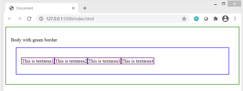
Here's the HTML we'll be working with:
body>
    <p>Body with green border</p>
    <div class="container superset1">
            <p class="textbox box1">This is textarea1</p>
            <p class="textbox box2">This is textarea2</p>
            <p class="textbox box3">This is textarea3</p>
            <p class="textbox box4">This is textarea4</p>

    </div>

</body>
Result:
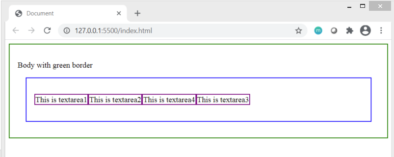
Understanding order implementation on child elements of flexbox container
When the child elements have lower or no values assigned to the order tag, they appear in the order of the HTML document as can be seen in above image.
However, when an order value of 1 is applied to .box1 we observe that it moves the very end, after all the other textarea boxes. This is because the HTML elements get positioned in increasing order of the value set to the order tag.
CSS
.box1 {
    order:1;
}
.box2 {

}
.box3 {

}
.box4 {

}
Result

Set .box2 a value of order:2
.box1 {
    order:1;
}
.box2 {
  order:2;
}
.box3 {

}
.box4 {

}
Result
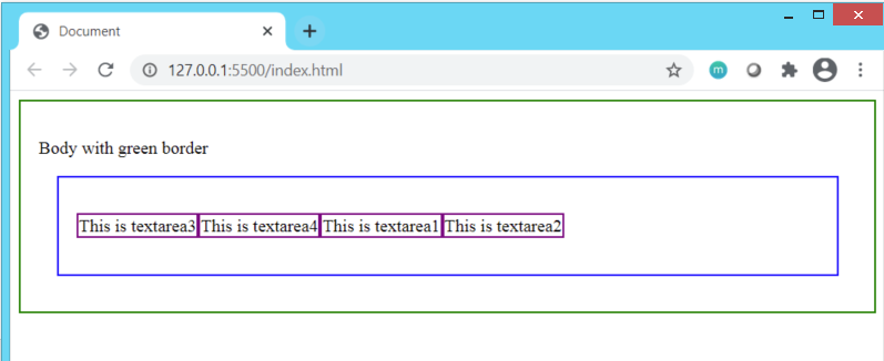
What if we assign .box4order value of 6 and .box3 order value of 7?
If you answered that textarea4 will appear before textarea3, then you are absolutely right!
.box1 {
    order:1;
}
.box2 {
  order:2;
}
.box3 {
  order:7;
}
.box4 {
   order:6;
}
Result
order property can turn out to be tricky to understand at the start but once you recall that the positioning will be in increasing order of values, you are sorted!
If you are interested in learning more about some other flexbox properties not covered here, I suggest you to hop over to this wonderful site
Thanks for reading till the very end. I hope you found this implementation oriented visual guide helpful to get started with flexbox!


