Understanding CSS Grid Implementation

If you are new to CSS Grid and wish to understand how the Grid properties work, then this implementation based article is all that you need! In this blog, we will be understanding the meaning of the properties & looking at executed examples to understand their implementation.
Grid has following benefits:
- Creation of two dimensional layouts becomes easier
- The HTML markup becomes simpler
- It has browser support & is flexible
Let's jump into grid & get started.
Here's the HTML markup we will be referring :
<body>
    <div class="grid-container">
      <div>1</div>
      <div>2</div>
      <div>3</div>
      <div>4</div>
      <div>5</div>
      <div>6</div>
      <div>7</div>
      <div>8</div>
    </div>
</body>
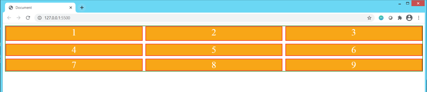
The initial CSS set for the above markup is as follows:
div {
    background-color: orange;
    text-align: center;
    font-size: xx-large;
    border: 2px solid red;
    color: white;
    margin: 0;
}
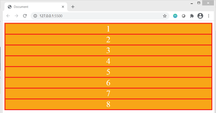
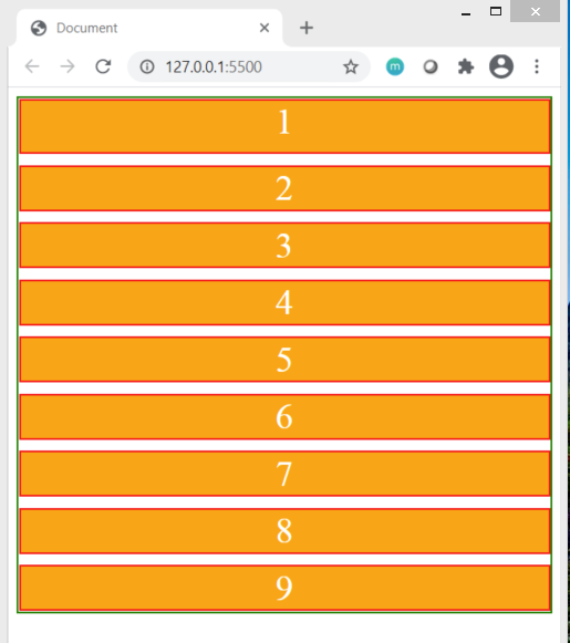
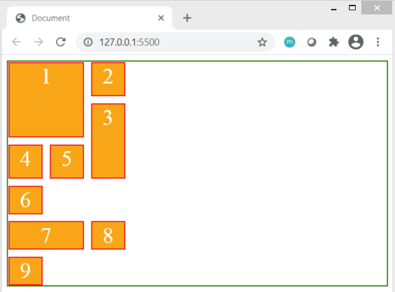
This is how it looks on screen :
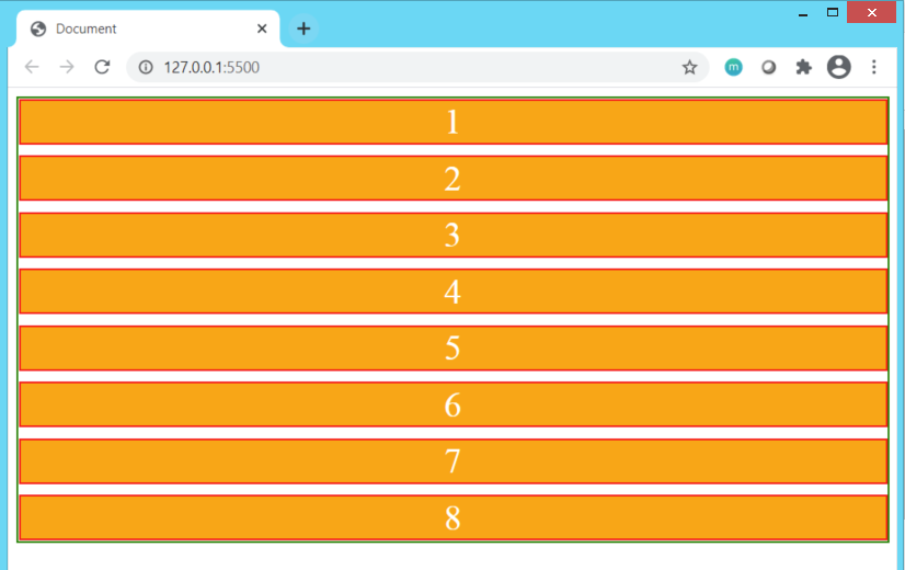
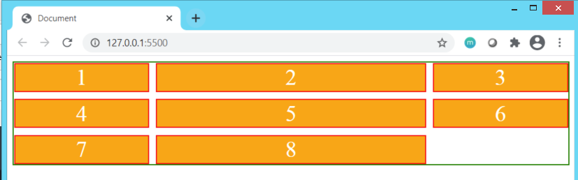
To set the markup in Grid Layout, we will define the display:grid; property in .grid-container.
Grid can be visualized of as a collection of cells arranged in a row-column format or a matrix. By applying grid-gap property with a value of 10px, we can specify the distance between that separates out the rows & columns. This results in the cells being uniformly distanced from each other by gap of 10px . Currently, as we have not defined number of columns or rows, only a single column is formed with 10px vertical gap between two cells. Notice how the entire available row space is coved by each cell of the column.
CSS:
.grid-container{
     background-color: white;
     border: 2px solid green;
    display:grid;
    grid-gap:10px;

}
Result:
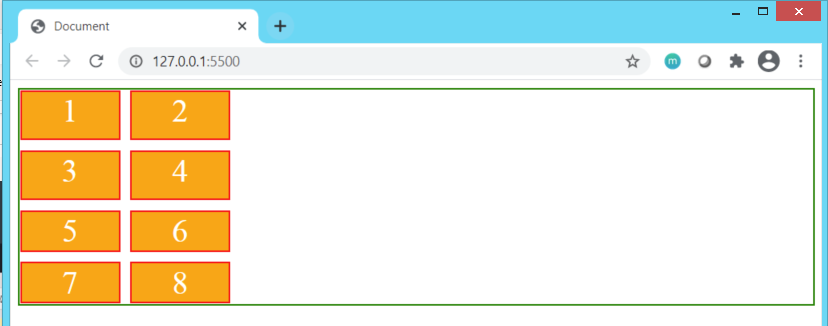
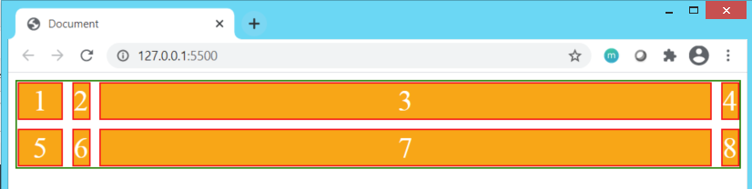
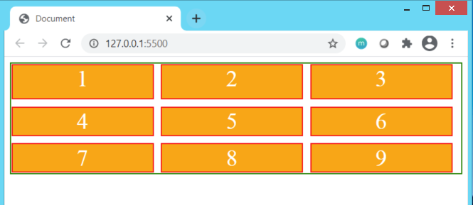
Applying grid-template-columns:100px 100px; to the above grid does two things:
- Forms columns
- Number of columns to be formed is specified by number of times the width of each column is defined. In our scenario, we have defined
100pxtwice, hence we will have 2 columns of width 100px each.
Similarly, applying grid-template-rows: 50px 50px creates two rows for the <div> tags to be distributed in & causing the height of each to be 50px
CSS:
.grid-container{
     background-color: white;
    border: 2px solid green;
    display: grid;
    grid-gap: 10px;
    grid-template-columns: 100px 100px;
    grid-template-rows: 50px 50px;
}
Result:
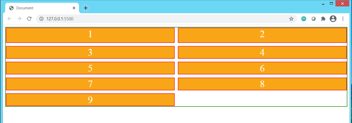
If we do not wish to define the width of the row in px units, we can use the fr units that represent fraction unit of the entire width available.
1fr refers to one fraction of the entire available container width. Apply fr units to grid-template-columns and grid-template-rows
CSS:
.grid-container{
    background-color: white;
    border: 2px solid green;
    display: grid;
    grid-gap: 10px;
    grid-template-columns: 1fr 1fr 1fr;
    grid-template-rows: 1fr 1fr;
}
Result:
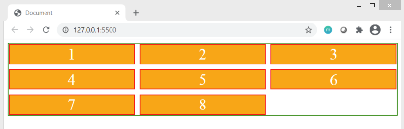 We can observe that as
 fr is defined thrice, 3 columns are created and the width of each column is set to one-third fraction of total available space. Let's set the width of the 2nd row to 2fr. This will result in the total width across all columns being divided into total 4 fraction units of which the 2nd column would have a width taken up by two fraction units of the entire available space.
CSS:
.grid-container{
    background-color: white;
    border: 2px solid green;
    display: grid;
    grid-gap: 10px;

    grid-template-columns: 1fr 2fr 1fr;
    grid-template-rows: 1fr 1fr;
}
Result:
Notice that the third row has taken up default row height & as the number of components do not fit into space of 2 rows & 3 columns, the remaining components have layered themselves out in a row-wise fashion across the width of the the columns automatically.
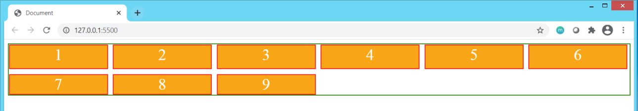
Using the auto keyword to define the width we can set the column width to automatically adjust itself with the available space. Similarly, specifying auto for rows sets the height of the row to fit the available vertical height.
CSS
.grid-container{
    background-color: white;
    border: 2px solid green;
    display: grid;
    grid-gap: 10px;

    grid-template-columns: 50px auto 1fr auto;
    grid-template-rows: 1fr auto;
}
Result:
 Observe that the column 1 has taken up 50px width, column 3 has taken up 1 fraction unit of width available and columns 2 & 4 have automatically adjusted themselves to take up the remaining space & fit themselves into the 1st row. The height of the 1st row is 1 fraction unit while the height of the 2nd row has adjusted itself to fir the remaining vertical height, which in this case is roughly the same as 1fr.
The benefit of using fr unit is that it grows and shrinks the size of the cell based on the available screen size making the content appear to be responsive in nature. Go ahead & try changing the screen size of your browser!
If you have multiple columns and rows of uniform width & height, how do you define them?
Surely, listing out
1fr for more than 5 times isn't something you want to do to have multiple large number of rows & column in your display! Here's the solution: the repeat(number of columns or rows, width or height value for each) function.
Let's increase the number of div tags we have to 50 & apply repeat() function to define the number of column & rows as well as set the width and height.
CSS:
.grid-container{
    background-color: white;
    border: 2px solid green;
    display: grid;
    grid-gap: 10px;

    grid-template-columns: repeat(10,1fr);
    grid-template-rows: repeat(5,50px);
}
Result:
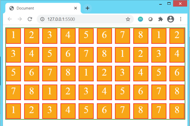 As you see, the
 repeat() function helps in quickly setting up the number of columns(10) and rows(5) as well as their height(50px) & width(1fr). Try setting the height & width as auto instead of 1frand 50px & observe how the div tags display.
Setting the width unit as fr helps stretch the the width of the column cell but does not increase or decrease the number of columns displayed in a row. To achieve this flexibility & increase the responsiveness of the website, we use auto-fit value in the repeat() function while specifying the number of rows & columns.
CSS
.grid-container{
    background-color: white;
    border: 2px solid green;
    display: grid;
    grid-gap: 10px;

    grid-template-columns: repeat(auto-fit,200px);
    grid-template-rows: repeat(auto-fit,50px);
}
Result 1
Increasing the browser screen size, Result 2:
Increasing the browser size further more,Result3:
We have adjusted the number of rows and columns that get created/removed based on the screen size but haven't yet addressed the flexibility of the width of a box to increase or decrease based on the size of the screen. To achieve this, we will use the minmax() function in the repeat() function to specify the range of width for the columns.
.grid-container{
    background-color: white;
    border: 2px solid green;
    display: grid;
    grid-gap: 10px;

    grid-template-columns: repeat(auto-fit,minmax(400px,2fr));
    grid-template-rows: repeat(auto-fit,50px);
}
Screen size 1 Result:
 Screen size 2 Result:
 Screen size 3 Result:
 As you can observe, the width of the boxes increase up 2fr when the screen size is large. On the other hand, it reduces down to not less than 400px when the screen size is small.
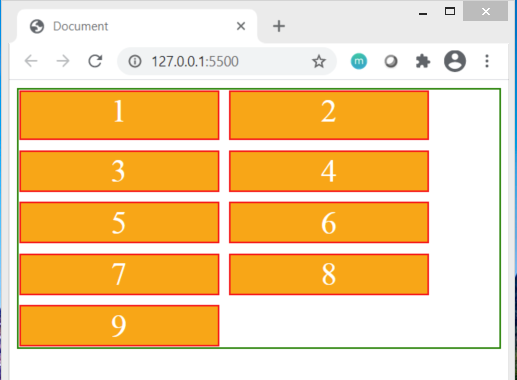
If you wanted a particular cell to begin from second column & extend till the last column (including it), how do we achieve that?
Perhaps you want the first cell to start from the first row and extend all the way down-vertically-till the second last row, covering up the entire height, how would you tell your grid to do that for you?
To understand this, we need to first understand that the matrix grid display is divided into cells by column-lines and row-lines Here's an image below that helps understand what column-lines and row-lines are:
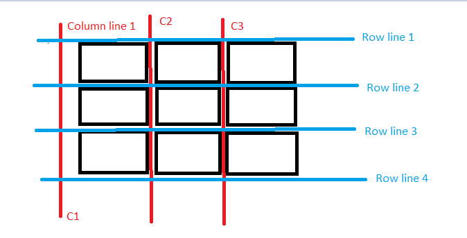
Our requirement is to have a column starting from column-line C1 and extending all the way till column line C3.
Also, we want our cell to begin at row-line 1 and extend all the way down till row line 3.
Let's try doing it for below markup
<body>
    <div class="grid-container">
      <div class="box1">1</div>
      <div class="box2">2</div>
      <div class="box3">3</div>
      <div class="box4">4</div>
      <div class="box5">5</div>
      <div class="box6">6</div>
      <div class="box7">7</div>
      <div class="box8">8</div>
      <div class="box9">9</div>
 </div>

</body>
CSS
.grid-container{
background-color: white;
border: 2px solid green;
display: grid;
grid-gap: 10px;
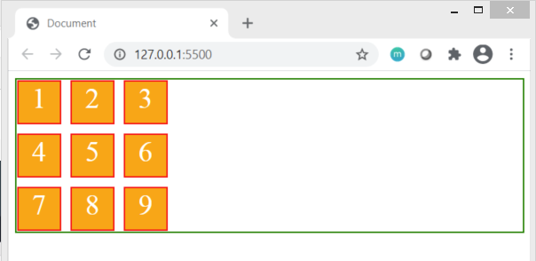
grid-template-columns: repeat(3,50px);
grid-template-rows: repeat(3,50px);
}
Result
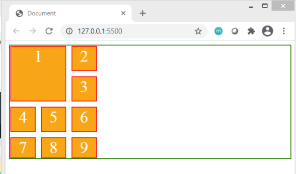
To achieve our desired result on box1, we will use the grid-column-start , grid-column-end , grid-row-start and grid-row-end properties:
.box1{
        grid-column-start:1;
        grid-column-end: 3;
        grid-row-start: 1;
        grid-row-end:3;
    }
Result:
If we want any other box, say box7, to extend all the way till column line 3 from it's initial starting point of column-line 1, we can simply use the grid-column property instead of using 4 properties implemented for box1. Similarly, If we want box3 to extend all the way from row-line2 to row-line4, we can use the grid-row property.
  .box7{
grid-column: 1/3;
    }

    .box3{
        grid-row:2/4;
    }
the / in the value assigned separates the start and the end lines assigned to the properties. When the number of columns or rows is not known & if you want the cell to extend till the very last row-line or column-line, you can use the -1 to represent the last row-line or column-line. See box6 implementation below
Alternatively, you can use keyword span followed by the row-line or column-line means to span across till the specified row-line or column-line. See box9 implementation below.
.box6{
        grid-column:1/-1;
    }
    .box9{
        grid-row:1/span 3;
    }
Result:
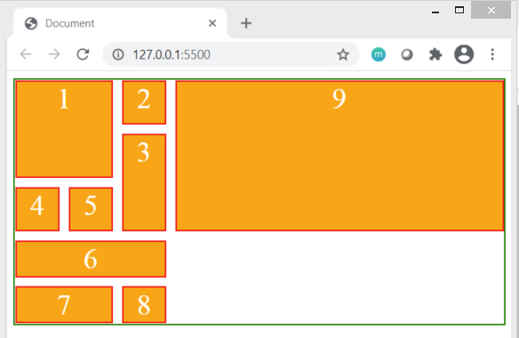
Box6 starts at column line 1 & extends till last column line 3.
Box9 starts at row-line 1 and spans till row-line 3.
Notice how box9 gets explicitly positioned after the fourth column line to implement the row-line positioning imposed over it, forming a fourth column within the given screens-size constraints.
Do try implementing & experimenting Grid Properties covered in this blog with values and layouts of your choice. Thank you for reading & I hope this blog proved to be valuable to you.


