Validate User Input with CSS UI Pseudo-Classes

In this blog I have covered some ways of performing validation of user input using CSS UI Pseudo-Classes for some frequently used input types. The article includes code snippets that aim to not only help you understand how the checks can be implemented, but also provide a better understanding of how UI Pseudo classes can be used to validate and guide user input.
A little about <input> tag
<input> tags are often used in web based forms. You are correct at guessing that the <input> tag in HTML helps accept user input but what you may not know is that the data accepted can be of different types, based on the type attribute defined in the <input> tag. By default, the type="text" attribute is adopted by the <input>tag if it isn't explicitly specified. The <input> tag is often accompanied by the <label></label> tags, positioned before or after the <input> tag, to let the user know about the expected data.
Code Snippets for Default <input> and <label> tag implementation
HTML
<div class="basic-input">
        <label>Enter some text:</label>
        <input class="custom">
    </div>
CSS
input.custom{
    caret-color: red;
    font: 16px "Helvetica", "Arial", "sans-serif"
}
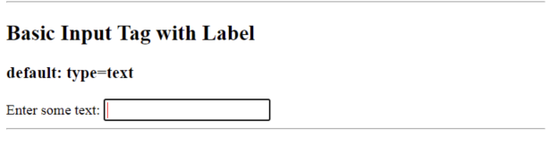
Notice the red cursor in the input box. This is due to the caret-color property that has been defined in CSS class .custom assigned to our basic user input of default type text.
CSS UI Pseudo Classes for type="text" input
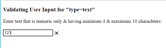
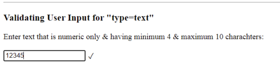
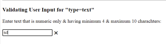
The <input> attributes minlength, maxlength, size and pattern paired with :invalid and :valid help check the user provided input. To hint the user about expected input, the placeholder attribute is used in the <input> tag.HTML
<div class="validated-basic-input">
        <label>Enter text that is numeric only & having minimum 4 & maximum 10 charachters:</label>
        <br><br>
        <input type="text" minlength="5" maxlength="10" pattern="^[0-9]*$" size="20" placeholder="Provide numeric input"><span></span>
    </div>
CSS
input + span {
    padding-right: 30px;
  }

  input:invalid+span:after {
    position: absolute; content: '✖';
    padding-left: 5px;
  }

  input:valid+span:after {
    position: absolute;
    content: '✓';
    padding-left: 5px;
  }
Note:The above CSS Pseudo Classes are being applied across all out <input> tags covered in the article below. Feel free to style the color & other CSS properties in your implementation.
Following are the screenshots of validations that suggest the user to correct the entered data
Here minimum-length attribute is not satisfied.
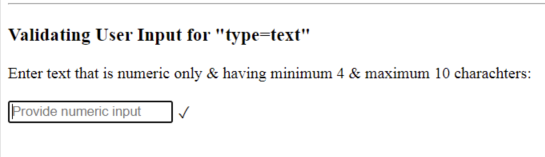
 In the below image, the length of numbers is between 5 & 10 charachters
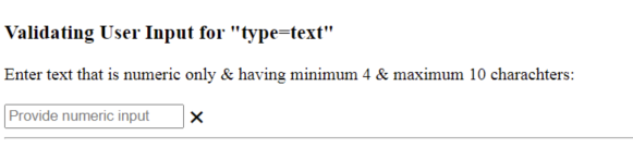
 This image shows that the specified RegEx pattern is not satisfied by user's input
 The size of the input box is set to 20 so that the placeholder text is visible to the user. Also, if the maxlength would have not been specified, then here the user would be informed visually that the size of his text input is limited to 20 characters & user will not be allowed to enter beyond the size limit.
To make a particular input field mandatory for the user to fill, we can include the required attribute in our <input> tag. In the absence of any input, the CSS Pseudo classes will mark it to be invalid as can be seen after the code snippet below. It also hints the user to fill in the data when the mouse hovers over the input box.
HTML
<div class="validated-basic-input">
        <label>Enter text that is numeric only & having minimum 4 & maximum 10 charachters:</label>
        <br><br>
        <input required type="text" minlength="5" maxlength="10" pattern="^[0-9]*$" size="20" placeholder="Provide numeric input" ><span></span>
    </div>
What if the input we require from the user is in a number format & we do not wish to permit the user to provide any other alphabetic input?
The type="number" input attribute
To receive numeric input from the user & remove the possibility of any other type of data being entered, we can implement the type="number" attribute in our <input> tag along with the above :valid and :invalid CSS pseudo classes. By including attributes min, max, step apart from the placeholder and required attributes learnt above, we can control & guide the user input.HTML
<div class="validated-basic-input">
        <label>Enter quantity:</label>
        <br><br>
        <input required type="number" min="10" max="20" step="3" placeholder="number" size="25" ><span></span>
    </div>
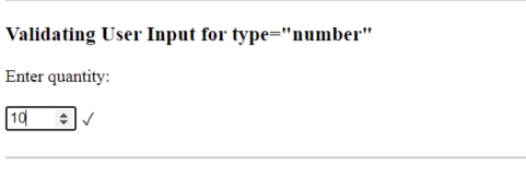
Due to min="10" the increment begins from 10.
 When user increments the value, it gets incremented by a count of 3. This is due to the
 step="3" attribute.
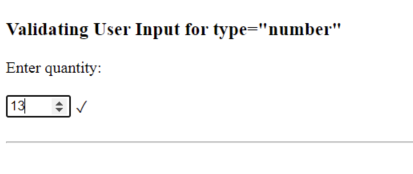 Due to the step count set to 3 & starting from 10, the values that lie between two step values (or example 11 that falls between 10 & 13) if manually entered by the user, are considered to be invalid input.
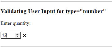 Due to
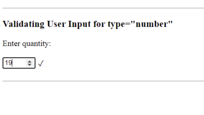
 max="20" the increment does not increase beyond 20 & halts at 19
When the step attribute is not defined, it increases & decreases by a value of 1. To have a decimal input, you can give a step of 0.10 i.e define the step as a decimal value.
Now that you've got to know the basic attributes that help check the user entered input, such as permitted length, non-numeric VS numeric and marking the input field as mandatory by using required attribute, let's quickly understand the code snippets for frequently used user input types & observe the validations that can be done using type specific attributes.
Input type="password"
The password type helps mask the user entered input with either * or dots depending on the browser. You can use the pattern attribute to make sure that the user entered password meets required safety protocols such as including alphanumeric values with one special character by assigning the pattern a suitable regular expression.
HTML
 <div class="validated-basic-input">
        <label>Enter password:</label>
        <br><br>
        <input required type="password" minlength="8" maxlength="15" size="16" ><span></span>
    </div>
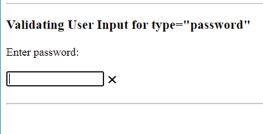
Checking that password is not empty by implementing the required field
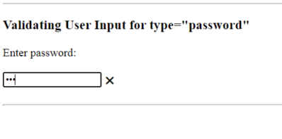
 Checking that the password is not less than defined minimum length
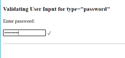
 Checking that password does not exceed permitted
 size. Here, the user cannot enter values beyond a specified character length.
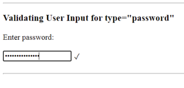
Shows valid input when password is within range
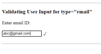
Input type="email"
To check the email ID is valid, we can set the type="email".Input attributes
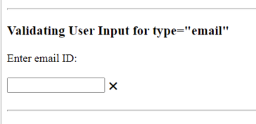
size, minlength , placeholder and required can be used to add additional checks on the value provided by the user. If the email address does not follow the universal pattern of @domain_name, then the CSS Pseudo classes mark the input as invalid.When the user has not entered any value
 The user has not provided correct email address
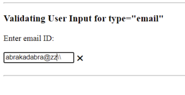 The user provides email address having
 @domain_name in its naming
Go ahead and try out implementing a pattern for your email ID input so that only email address from a particular domain are permitted to be provided by the user.
Multiple email addresses can be accepted from the user when the attribute multiple in mentioned. However, when multiple address is permitted, empty input is also validated as correct input by the pseudo classes. The multiple email address are separated by comma , .
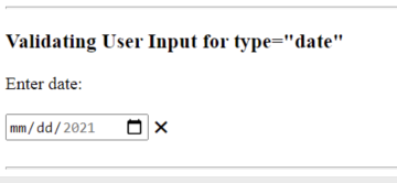
Input type="date"
Setting the input type="date" attribute helps make sure that the entered input isn't anything else but a date. You can use the min and max attributes to make sure the user enters a date that lies within the specified time duration . Implementing the required attribute helps check that the field is not left empty by the user.
HTML
   <div class="validated-basic-input">
        <label>Enter date:</label>
        <br><br>
        <input type="date" min="2021-01-01" max="2021-02-01"  required><span></span>
    </div>
Field is left empty by user
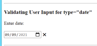
 Date is not in the range specified, when entered without using the date picker drop down
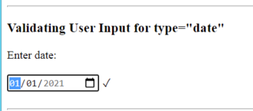
 Date is in Range Specified
 Try implementing this to experience the disabled values in the date picker drop down that do not permit the user to enter dates outside the specified interval.
Its always necessary to have a validation in place at the backend to make sure user entered input ( via form submissions or without forms) is of appropriate format and type. However, implementing the above discussed UI validations should help perform & guide the user into submitting appropriate details.
Thanks for reading through this article. I hope it helped you learn & get motivated to start exploring other CSS Pseudo classes!


